The Quail's Nest
June 30, 2023
Project #2: Garden Builder
This month I wanted to create something that would capture the feeling of planting a garden.
Note: In this version, you cannot move a plant once you’ve placed it.
How it got made
Initial thoughts
To start, I considered my own garden (if you can call it that–it’s really just a front stoop covered in pots). I decided I wanted to try and capture two elements in particular: the strategic planning of giving each plant enough space to collect sunlight and nutrients, and the aesthetic play of arranging them so they create a pleasing visual.
Time for a prototype. I generally sketch out ideas on my tablet, using the Concepts app.
First Pass
I started by figuring out how simple I could make the visuals. Here’s the first attempt:
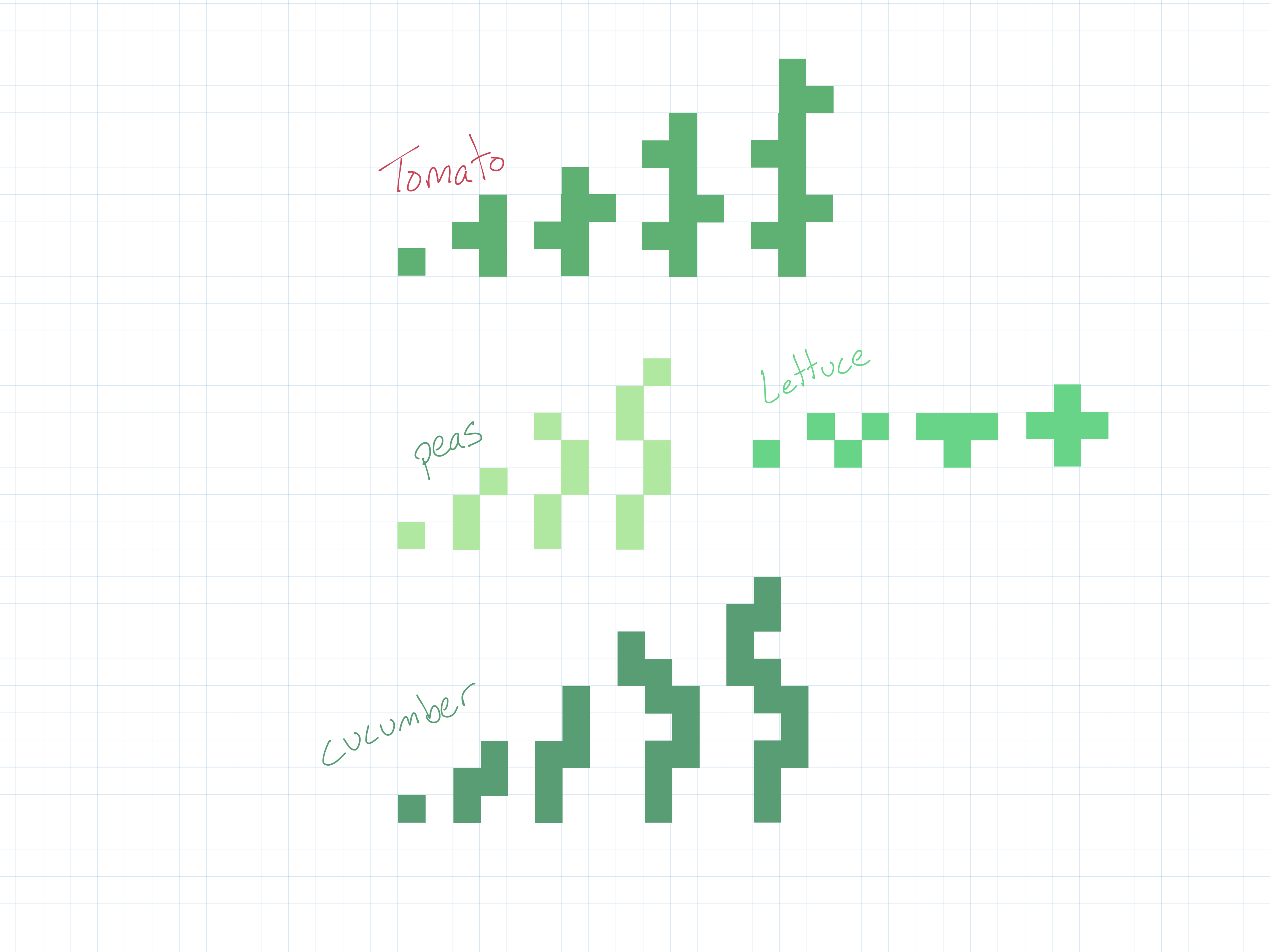
Each plant starts as a seedling, which grows into its full-size version accross the 2D grid.
In action, it would look something like this:
Second attempt
I decided to put the growing aspect aside for the moment, and focus on the strategic element of fitting the plants together.
I used the same idea of colored squares, but added a border around each one so they would stay visually distinct when placed all together. They even have labels so you can tell what’s what.
Here’s how it looks in action:
I think I’m on to something here–it kind of feels like super chill tetris, or piecing together a puzzle. It really centers on the strategic placement elements of a garden. Playing around with it, I realized that there is something about the organic shapes of real plants that is fundumentally tied to the aesthetic play I want to capture. This version is really missing that.
Third try
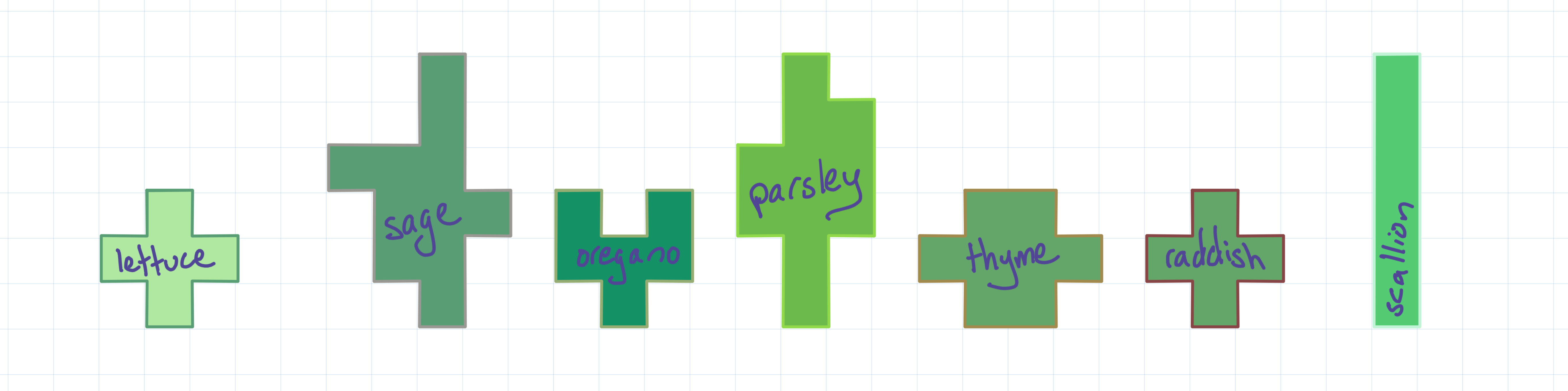
Ok, keep the grid: the strategic element of the previous version was good. But it needs organic shapes. I decided to see what would happen if I switched to an isometric grid instead of a square one. Plants still take up specific configurations of grid spaces, but now they have a visual element separate from that.
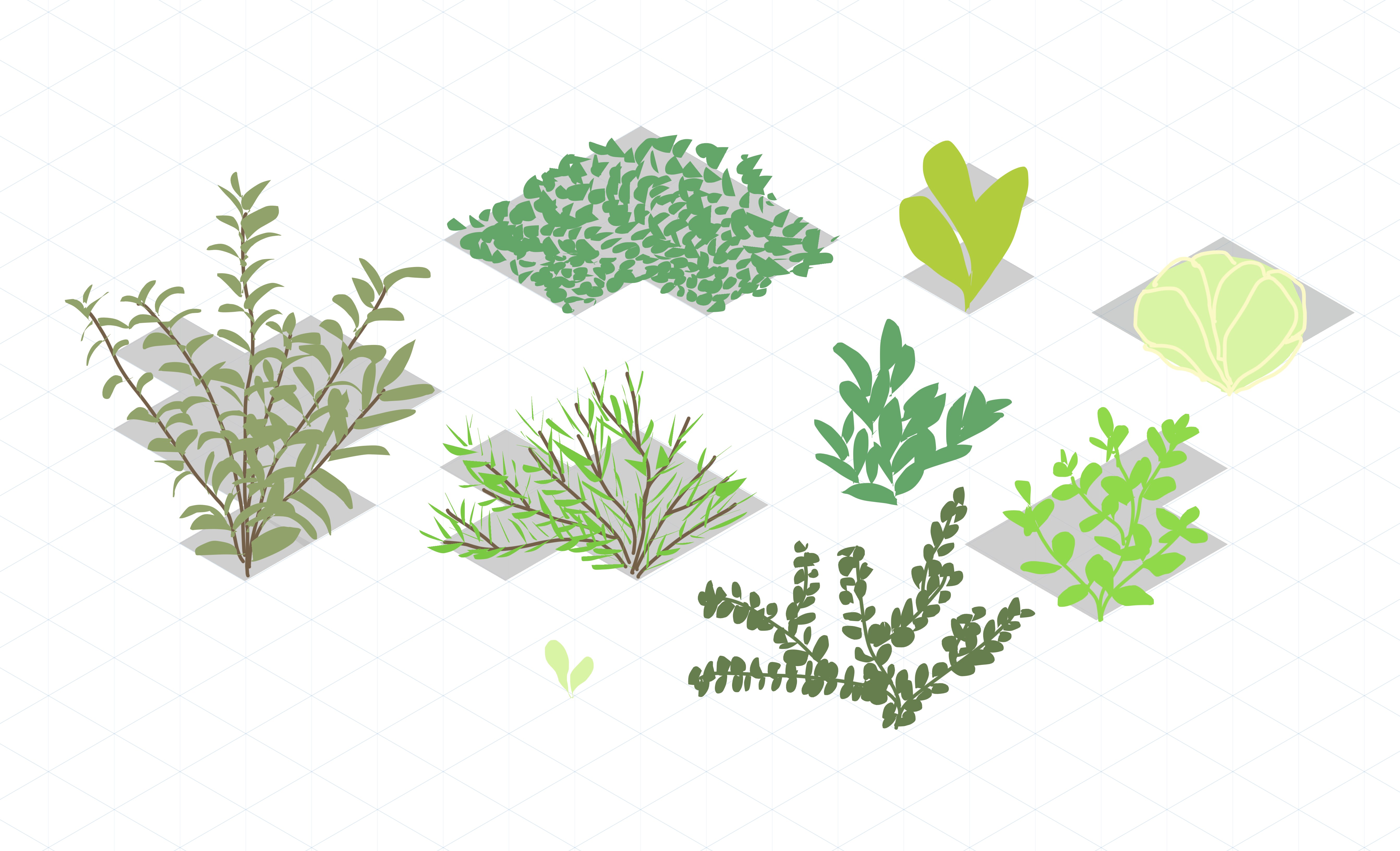
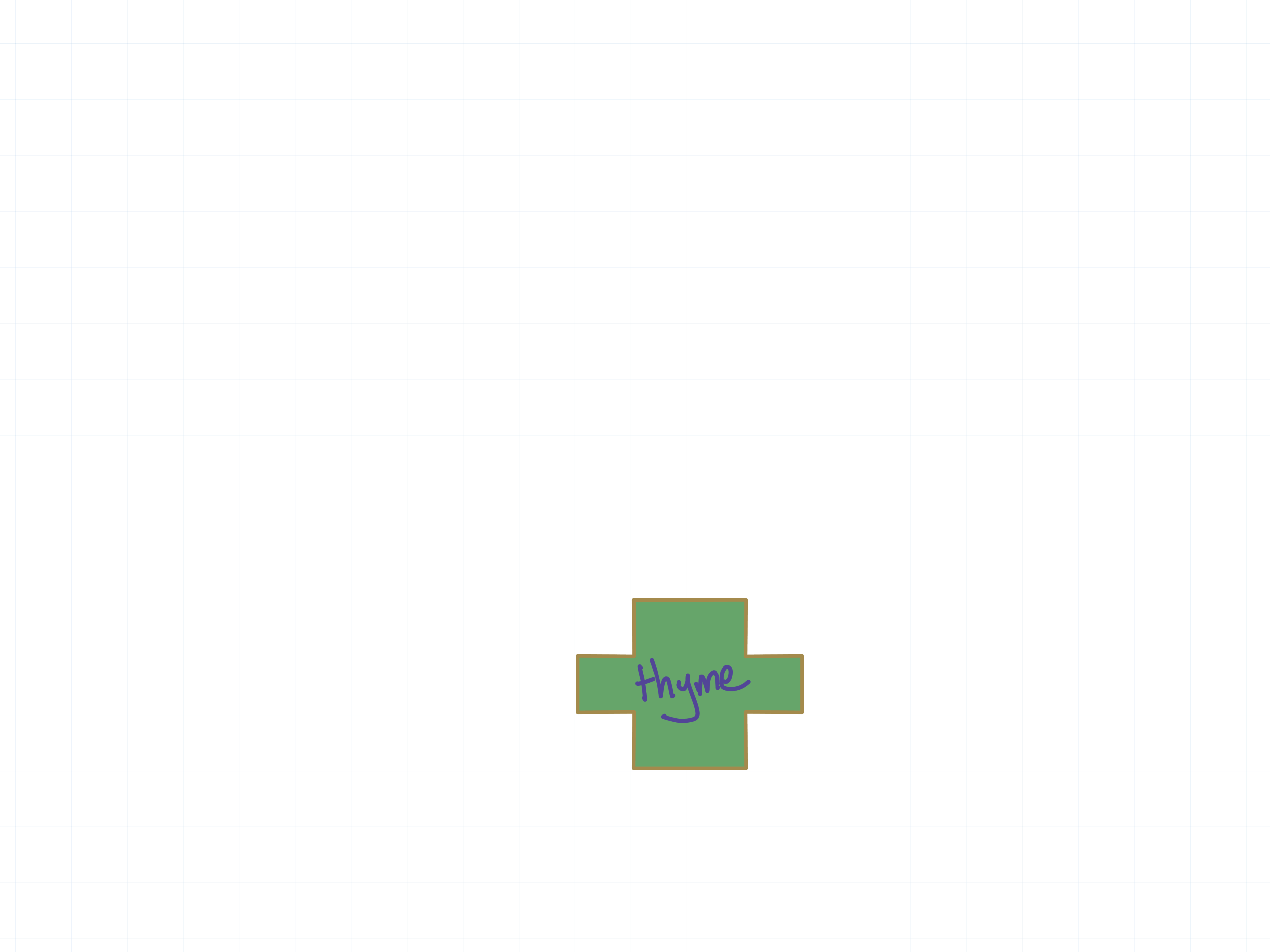
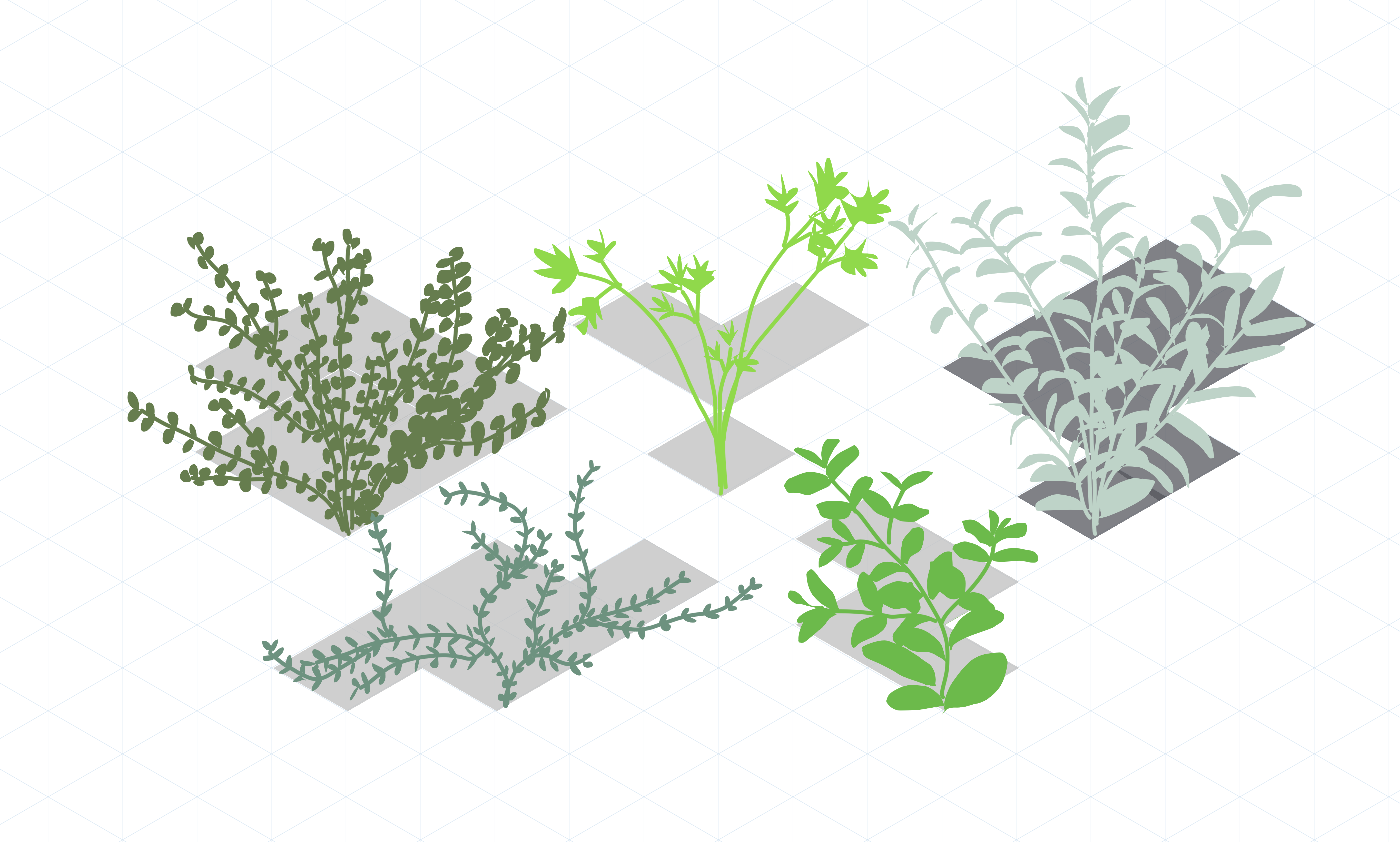
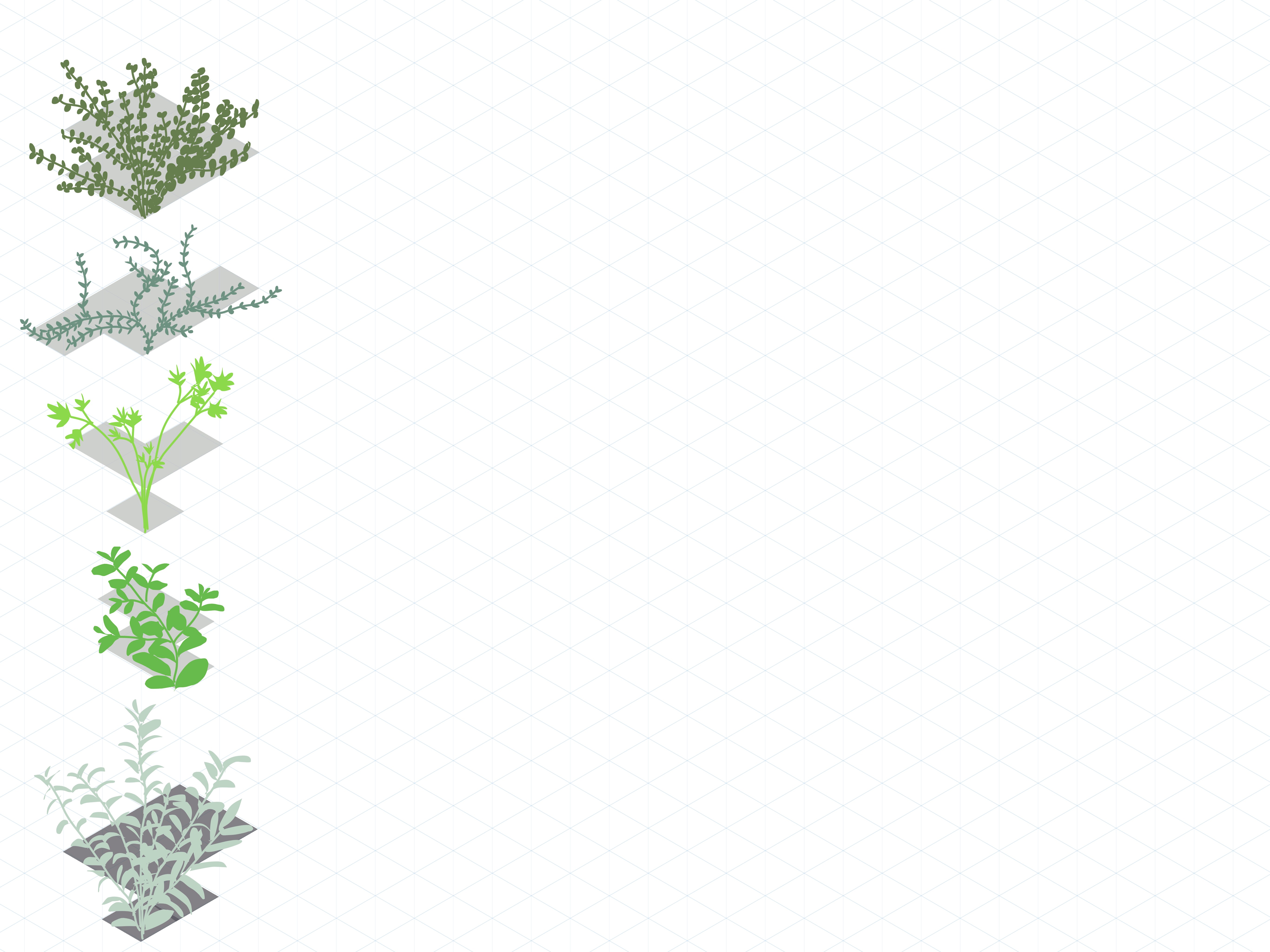
I like where this is going. Let’s limit the scope and just stick to herbs for now:
Time to implement the thing
To build the project I used ClojureScript and PixiJS. I wanted to get the basic plant placement working first, before dealing with rules on overlapping and grid areas. The basics took longer than I expected, and in the end I didn’t have time to implement anything beyond simple plant placement.
Reflections
A lot had to be cut for this project to be done on time. I’m not sure it really captures what I initially wanted, but I think it has some potentential, and with more time could be built into something interesting.
There are a couple of quality-of-life things I really wish I had time to implement. The most pressing is a a reset button, so you can start over without having to reload the whole page. Also the ability to move a plant after you’ve placed it down would add a lot to the overall experience.
That’s all for now. Come back next month for something new!